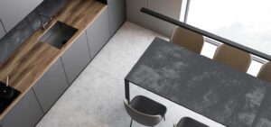
In this era of rapid urbanization, space in cities is in limited supply. As a result, homes are getting smaller. That doesn’t mean we cannot build our dream homes anymore. With latest advancements in construction sector and interior designing, we can get the most out of our homes, no matter how limited the space is. We might not get all the space we want, but who’s stopping us from creating the illusion of larger spaces in our homes? Yes, if we choose the right wall and floor tiles we can make our rooms appear larger than they are. This article specifically deals with the problems of smaller kitchens.
By simple using larger slabs tiles on the floor, you ensure that your kitchen doesn’t feel cramped or narrow. But that’s not all there is to it. Let us discuss a few more tiling hacks that you can incorporate in your compact kitchen.
- Large format tiles
The fundamental principle is that the smaller tiles mean more grouting lines; and the more the grouting lines the busier the layout looks. So, the first thing that you should consider while laying tiles on your kitchen floor is that choose large format tiles. Large tiles with fewer grouting lines looks seamless thus making the room look more spacious. Another recommendation is that you use matching colored grout instead of a contrasting one. Matching grout blends in with the tiles thus making the borders of tiles disappear.
You can easily find large tiles i.e. 120cmx240cm at any branded dealership store near you. - Choose tiles in pale tones
Tiles with paler shades reflect the most of the light that falls on the surface. It creates the visual effect of an open space. You can use these reflective tiles on both floors and walls of your kitchen. Dark-toned tiles absorb light and make the space feel constricted. - Glossy tiles
Choose glossy tiles over matte tiles. Glossy tiles have glazed surface which bounces off the light and makes room feel more spacious. - Simple, plain tiles
Heavily patterned tiles might look enticing but they are not functions as far as compact spaces are concerned. These tiles dominate the visual space of the room and make the room look cluttered. Stick to a plainer, simpler pattern that ensures ample breathing space in terms of design.
- Go with simple colour palette
While working on a compact kitchen, limit the use of colors. Go with a minimalist look. The easiest way to create minimalistic design is by going easy on color. Choose simple, mono-chrome palette in lighter shades. A full-blown extravaganza of colors will make your space feel busy and ‘filled up’. Therefore, try to match the color of wall and floor tiles as much as possible so that you get the sense of seamless design.
- Simple configuration
Don’t go overboard with your tile arrangement pattern. The more straight the pattern, the more spacious it appears. You might be attracted by a trendy pattern like herringbone, but it will only add to the ‘busy-ness’ of the design. In simpler layouts such as horizontal and vertical tile arrangements you have full-size tiles with minimum cuts. It creates an illusion that the surface has more area. If you are installing rectangular tiles, ensure that they are arranged length-ways. It will give the eye an elongated perspective of the room.
While we optimised these tips to make your kitchen look larger, you can use these hack for any kind of space, indoor or outdoor.
Also, if you don’t know where to start, start with visiting NEOM tiles and checking out their modern tiles collections. They have everything we mentioned in this article and more. From glazed tiles to large size tiles, they have exquisite designs and patterns in all kinds of tiles. So, visit a dealership near you today or log on to their website and fall in love with tiles.

